- O2 Community
- Welcome & News
- Welcome & News
- Re: New forum looks cool!
- Subscribe to RSS Feed
- Mark Topic as New
- Mark Topic as Read
- Float this Topic for Current User
- Bookmark
- Subscribe
- Mute
- Printer Friendly Page
New Community homepage is live! :)
- Mark as New
- Bookmark
- Subscribe
- Mute
- Subscribe to RSS Feed
- Permalink
- Report Content
on 04-02-2019 09:58 - last edited on 04-02-2019 18:06 by Marjo
Hi everyone,
I'm sure you've noticed if you've visited before, that our forum is looking a bit different today. We've been working hard for the past several months on making changes to the community homepage, and finally went live with the new version this morning! ![]()
We have been listening to your feedback from our discussions around what you like or don’t like on the homepage, passing it on to the designers and developers, along with ideas that you’ve come up with, and tried to get as much as possible included. A BIG thank you to everyone who have provided your views over the years. ![]()
The update has brought several changes to the layout and to the different features of the page:
Welcome and search
- FAQs are linked from the top underneath the search bar, for quick look at the most-asked questions.
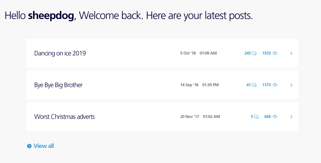
- If you're logged in, you have quick access to your latest posts right on the homepage. If you're logged out, you will see instead a login box and quick general information about what the community is about.
- Underneath that you have 3 quick links to help you get started: 1) info topic on what's the community about and how to get help, 2) topic listing all the different forum boards, and 3) the how-to guides board.
Notification Feed
A new feature on the right side of your avatar, next to your "My Settings", "Messages" (PMs) and "Unread posts" links when you are signed in. You can see a list of recent activity here related to topics you've participated in, e.g. if someone has given you a Kudos, replied to your posts, or @-mentioned you on the forum.
Community Topics and contributors
- See what everyone’s been chatting about with top and latest discussions.
- You can also help with unanswered questions or ask your own.
- You can see a list of current top contributors on the right

Most Popular Searches
- See the popular searches that others have made on the community to help you with your query
Latest News
- 3 latest topics that we've wanted to highlight!
Popular Topics
- Especially helpful for those looking for help: you'll see 2 most-used community how-to guides, with related Solved topics underneath.
Activity
- Some stats about the community where you can see number of active members and click into member search, number of members online (if they've set themselves visible in their settings) with a link to view all, total posts and questions solved.
We know that big changes can be annoying and even stressful to users if the old layout has been there for long (we had the previous look since 2014!!), and some of the abovementioned elements are both new and different from what we've had before. Now that the changes are live, we will be testing and monitoring over time to see how the page performs.
We'd love to hear your feedback:
We'd love to hear what you think of this new change. Do you like the design and feel of the homepage and its new sections? Do you think it's an improvement to the old design? What is your initial feeling around navigating the forum, finding and replying to topics, etc?
Also, since we've just gone live today, don't hesitate to alert us if you see something that's not quite right. We've done a lot of testing but there can always be some lingering bugs or issues that we might have missed.
Your continued feedback will be much appreciated as always to help us plan for future improvements. ![]()
Cheers,
The Community Team
→ COVID-19 support - Help and support from O2 during the lockdown
→ Access for You: Registration - Find out how to register for our Access for You service.
→ Just joined the community or thinking of registering? Check out this handy starter guide!
→ Have a query about your account? login to My O2 for help
If you'd like to take part, why not register? 
- 7881 Posts
- 468 Topics
- 55 Solutions
04-02-2019 15:02 - edited 04-02-2019 15:04
- Mark as New
- Bookmark
- Subscribe
- Mute
- Subscribe to RSS Feed
- Permalink
- Report Content
04-02-2019 15:02 - edited 04-02-2019 15:04
Ok I realised what you meant by "homepage" @Cleoriff, I think you mean the list of different boards (those blue tiles with links to the boards) that was visible on the previous homepage. I see a few of you are asking about the boards. On this new homepage, the way to navigate around the forum is a bit different. It might take some time to get used to. Here are a few tips that I hope will help, for also your question @jonsie around how to post a new topic in a specific section:
3 quick links below your latest posts (or the welcome / sign in slot if you're logged out):
- From the middle link "Explore the forum", you can get to a topic in Welcome & News where we have listed all the boards.
When you're in a thread:
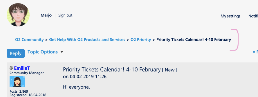
- you can use the "breadcrumb" links at the top of the thread to get to the relevant board or category of boards.
On the homepage:
- When you scroll down to the Community Topics, you can see a button for "Ask a question. This brings you to the page where you can post a new topic on the board you choose.
The breadcrumb links I mentioned above look like this on top of threads:
Thanks @Cleoriff, we've captured your comment around the missing number of PMs next to the Messages link! 
- 152206 Posts
- 651 Topics
- 29009 Solutions
on 04-02-2019 15:02
- Mark as New
- Bookmark
- Subscribe
- Mute
- Subscribe to RSS Feed
- Permalink
- Report Content
on 04-02-2019 15:02
@sheepdog wrote:Where am I? I feel like I'm being trapped in a store after hours with no lights on? Has Mod14 been involved in this redesign??
Can we have the list of forums back please.
Click on Explore the forum....
Please select the post that helped you best and mark as the solution. This helps other members in resolving their issues faster. Thank you.
- 3369 Posts
- 31 Topics
- 39 Solutions
on 04-02-2019 15:31
- Mark as New
- Bookmark
- Subscribe
- Mute
- Subscribe to RSS Feed
- Permalink
- Report Content
on 04-02-2019 15:31
So let me summarise this redesign: we've moved all the easy to find links and buried them.
I'll set up my bookmarks/quick links for each forum, its a lot easier than having to be explained how to navigate through this.
- 152206 Posts
- 651 Topics
- 29009 Solutions
on 04-02-2019 16:08
- Mark as New
- Bookmark
- Subscribe
- Mute
- Subscribe to RSS Feed
- Permalink
- Report Content
on 04-02-2019 16:08
@Marjo wrote:Thanks @Cleoriff, we've captured your comment around the missing number of PMs next to the Messages link!
Not showing for me also...
Please select the post that helped you best and mark as the solution. This helps other members in resolving their issues faster. Thank you.
- Mark as New
- Bookmark
- Subscribe
- Mute
- Subscribe to RSS Feed
- Permalink
- Report Content
on 04-02-2019 17:07
- 7881 Posts
- 468 Topics
- 55 Solutions
on 04-02-2019 18:31
- Mark as New
- Bookmark
- Subscribe
- Mute
- Subscribe to RSS Feed
- Permalink
- Report Content
on 04-02-2019 18:31
Hi everyone, thanks for the comments so far @Cleoriff, @gmarkj, @jezza1234, @Bambino, @jonsie, @Poppysmum, @sheepdog, @liggerz87, @MI5! Having gone through these, there seems to be a few common themes we can spot, just letting you know we've captured these and would like to discuss more soon. 
- Top O2 menu, specifically the sign-in link, has created some confusion when trying to login directly to the community instead of My O2
- The top image feels very big across all community pages and requires more scrolling
- Lack of a number specifying how many unread PMs you have in the top "Messages" link
- List of categories on the homepage to navigate directly to discussion boards. It's definitely a big change that it's no longer visible as direct links, a new way of navigating around the forum on this new version - it seems that you are missing the previous structure and it would be great to hear more around how you were using it before and what specifically you miss about the old one so we understand a bit better?
Please do keep the feedback coming, and apart from these that have already been mentioned, do you have any comments around the general feel of the page compared to the old homepage? 
To add also, I've just edited in a brief description in the list of new features above relating to the Notifications feed. That's something we didn't have earlier so please do try it out also when you get a moment. 
Cheers everyone
- 3369 Posts
- 31 Topics
- 39 Solutions
on 04-02-2019 19:36
- Mark as New
- Bookmark
- Subscribe
- Mute
- Subscribe to RSS Feed
- Permalink
- Report Content
on 04-02-2019 19:36
Is it just me or does "here are all your latest posts" meant to say "here are your started topics"?
Screenshot:
@Marjo its the fact that you got to the main page and knew exactly where you wanted to go. Simple! At the moment the new look is not engaging me to click anywhere of interest other than what is (forced) suggested.
Is that a design decision to put the "popular searches" in the middle of the page rather than the logical place of just below the actual search bar? Its orphaned where it is now and has no real context for the user.
Is there any need for search a large sized icons for the "activity" section. Seems to be a bit of a contradition in that there's 2.4 million members and only 25 solved problems (as if its like some of us come on here only to talk about Dancing on Ice  )
)
- 128531 Posts
- 835 Topics
- 7598 Solutions
on 04-02-2019 19:50
- Mark as New
- Bookmark
- Subscribe
- Mute
- Subscribe to RSS Feed
- Permalink
- Report Content
on 04-02-2019 19:50
- 40376 Posts
- 246 Topics
- 1816 Solutions
04-02-2019 20:27 - edited 04-02-2019 20:47
- Mark as New
- Bookmark
- Subscribe
- Mute
- Subscribe to RSS Feed
- Permalink
- Report Content
04-02-2019 20:27 - edited 04-02-2019 20:47
The nice arched image is a little on the large side, consuming much screen real-estate on a laptop (landscape) vs the mobile view (portrait on a smartphone). Could it be trimmed down a touch, perhaps?
Also the "Unread Posts" *still" defaults not to "Discussions" view but to the view with every response showing with a "Re:..." on it.
And to add pictures on a smartphone you still have to go into "Full" view from "Mobile" view.
Seems to e a common thread here 
Oh, and I asked the moderator to move my "Look, a new forum layout" thread into this thread - that should rattle a few bugs or two! ![]()
- 40376 Posts
- 246 Topics
- 1816 Solutions
on 04-02-2019 20:37
- Mark as New
- Bookmark
- Subscribe
- Mute
- Subscribe to RSS Feed
- Permalink
- Report Content
on 04-02-2019 20:37
And the timestamps are an hour out in the two different views (posted at 07:28 as shown in the first image):
And an hour later as shown in the new homepage:
![]()


.gif)

