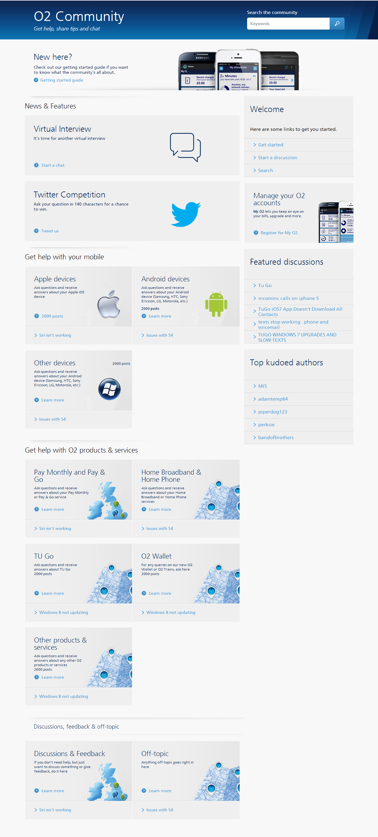
- O2 Community
- Discussions, Feedback & off-topic
- Discussions & Feedback
- Re: Community Redesign
- Subscribe to RSS Feed
- Mark Topic as New
- Mark Topic as Read
- Float this Topic for Current User
- Bookmark
- Subscribe
- Mute
- Printer Friendly Page
Community Redesign
on 16-01-2014 09:45
- Mark as New
- Bookmark
- Subscribe
- Mute
- Subscribe to RSS Feed
- Permalink
- Report Content
on 16-01-2014 09:45


on 18-01-2014 18:38
- Mark as New
- Bookmark
- Subscribe
- Mute
- Subscribe to RSS Feed
- Permalink
- Report Content
on 18-01-2014 18:38
I personally do not like any of those designs. Having such large boxes for each forum sub section is a waste of screen space and creates a product where the end user is needlessly scrolling. Now if those boxes where 1/4 of the size they are shown on screen, I wouldn't mind it, but as it stands, they are massive.
But yes, do lose all the junk from the right side of the community index. And add ways to minimize a section with a down/up arrow at the top of each section.
As regards different areas of the community. I would like to see the option to define a social background removed. And the user icons displaying in a post as the same size that they display on the person's profile.
- 1721 Posts
- 50 Topics
- 65 Solutions
on 19-01-2014 17:19
- Mark as New
- Bookmark
- Subscribe
- Mute
- Subscribe to RSS Feed
- Permalink
- Report Content
on 19-01-2014 17:19
Of the 3 I prefer the second one though I agree with some of the others that the boxes could be made smaller. Number 3 being cleaner but more basic may look better on lower resolution devices however.
Is there also a redesign for the mobile interface?
Reviews: iPhone-X-first-impressions ¦ Blackberry Classic ¦ Blackberry Z30 ¦ Nokia Lumia 1020 ¦ Samsung S4 Mini Part 1 ¦ Samsung S4 Mini Pt. 2
- Mark as New
- Bookmark
- Subscribe
- Mute
- Subscribe to RSS Feed
- Permalink
- Report Content
on 19-01-2014 17:22
- Mark as New
- Bookmark
- Subscribe
- Mute
- Subscribe to RSS Feed
- Permalink
- Report Content
on 19-01-2014 18:38
I'd also like to see a qoute button on each post in a thread (when viewing a thread), rather it being tucked away behind the reply+reply window.
- Mark as New
- Bookmark
- Subscribe
- Mute
- Subscribe to RSS Feed
- Permalink
- Report Content
on 20-01-2014 12:35
- Mark as New
- Bookmark
- Subscribe
- Mute
- Subscribe to RSS Feed
- Permalink
- Report Content
on 20-01-2014 12:35
@Anonymous wrote:
I'd also like to see a qoute button on each post in a thread (when viewing a thread), rather it being tucked away behind the reply+reply window.
Thanks for the suggestion, SeaCat. We'll see if the platform allows it.
- Mark as New
- Bookmark
- Subscribe
- Mute
- Subscribe to RSS Feed
- Permalink
- Report Content
on 20-01-2014 12:36
- Mark as New
- Bookmark
- Subscribe
- Mute
- Subscribe to RSS Feed
- Permalink
- Report Content
on 20-01-2014 12:38

- Mark as New
- Bookmark
- Subscribe
- Mute
- Subscribe to RSS Feed
- Permalink
- Report Content
on 20-01-2014 12:44
- Mark as New
- Bookmark
- Subscribe
- Mute
- Subscribe to RSS Feed
- Permalink
- Report Content
on 20-01-2014 12:59
Absolutely, PapaDug, that's something we started looking at even before discussing the desktop redesign 


