- O2 Community
- Discussions, Feedback & off-topic
- Discussions & Feedback
- Your feedback on the Community Search page
- Subscribe to RSS Feed
- Mark Topic as New
- Mark Topic as Read
- Float this Topic for Current User
- Bookmark
- Subscribe
- Mute
- Printer Friendly Page
Your feedback on the Community Search page
- Mark as New
- Bookmark
- Subscribe
- Mute
- Subscribe to RSS Feed
- Permalink
- Report Content
on 16-02-2018 15:04
Hi guys, I hope you're having a good day today!
As you may know, we've been doing some work in the background to improve the community forum and continue doing that in 2018. One of the areas we will be looking at is the Search page of the community.
Since you guys as community members are using the search the most, we'd like to ask what you think of the current forum Search, and if there's anything that you would improve?
We're especially looking for your opinions on how to improve the search results page.
Looking forward to your thoughts. 
![]()
![]()
- Mark as New
- Bookmark
- Subscribe
- Mute
- Subscribe to RSS Feed
- Permalink
- Report Content
on 26-02-2018 15:06
@Marjowrote:Hi @Anonymous, welcome back!
Yeah @jonsie is correct, the Ideas section was archived back in December, so that's why you can't find it. Very much appreciated all the ideas posted by community members, however the process at the moment on our end wasn't working as well as we were hoping - so that particular style of board was archived. Doesn't mean we don't want to hear your ideas though, so if you have any and want to share and discuss with other members, please do pop it in the Feedback board. We share feedback and ideas from there regularly with O2.
Thanks for clearing that up, I thought I was losing the plot for a moment 
- 7881 Posts
- 468 Topics
- 55 Solutions
on 09-03-2018 15:55
- Mark as New
- Bookmark
- Subscribe
- Mute
- Subscribe to RSS Feed
- Permalink
- Report Content
on 09-03-2018 15:55
Just letting you know the search page is being worked on at the moment with the intention that it would be simpler and clearer to use. We will let you know when we have an update about the timing of when the changes go live. 
- 134813 Posts
- 848 Topics
- 7624 Solutions
14-03-2018 07:51 - edited 14-03-2018 07:52
- Mark as New
- Bookmark
- Subscribe
- Mute
- Subscribe to RSS Feed
- Permalink
- Report Content
14-03-2018 07:51 - edited 14-03-2018 07:52
Hi @Marjo
Yesterday we heard that improvements to the search page would be pushed through by this morning.
I have just looked and can't see any change. ![]()
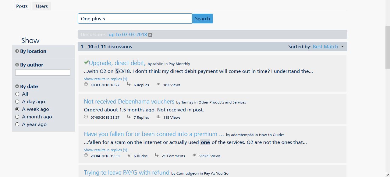
I looked for ALL and got a few random results then I shortened the search to a week.
I got this
I realise One Plus 5 may not have been discussed during this last week, however, it's no good to anyone if the search results are just picking out one word such as One or 5
If no results are found then it should say so
Also, I have never understood the relevance of the search box showing 'By Location' or 'By Author'
Having said all of the above, maybe the changes haven't been made yet? ![]()
Veritas Numquam Perit

- 13222 Posts
- 95 Topics
- 1188 Solutions
on 14-03-2018 09:08
- Mark as New
- Bookmark
- Subscribe
- Mute
- Subscribe to RSS Feed
- Permalink
- Report Content
on 14-03-2018 09:08
Has anyone done a guide to using the search function?
Please note, this is not customer services and we cannot access your account. Do not publish personal details (email, phone number, bank account).
Link to our guide on how to contact them can be found here
- 134813 Posts
- 848 Topics
- 7624 Solutions
on 14-03-2018 09:28
- Mark as New
- Bookmark
- Subscribe
- Mute
- Subscribe to RSS Feed
- Permalink
- Report Content
on 14-03-2018 09:28
- 13222 Posts
- 95 Topics
- 1188 Solutions
on 14-03-2018 09:46
- Mark as New
- Bookmark
- Subscribe
- Mute
- Subscribe to RSS Feed
- Permalink
- Report Content
on 14-03-2018 09:46
Can we get it added to the Knowledge Base?
Please note, this is not customer services and we cannot access your account. Do not publish personal details (email, phone number, bank account).
Link to our guide on how to contact them can be found here
- 98719 Posts
- 617 Topics
- 7253 Solutions
on 14-03-2018 17:33
- Mark as New
- Bookmark
- Subscribe
- Mute
- Subscribe to RSS Feed
- Permalink
- Report Content
on 14-03-2018 17:33
Some people manage to find 5 year old threads to post on but yes Google for me!
- Mark as New
- Bookmark
- Subscribe
- Mute
- Subscribe to RSS Feed
- Permalink
- Report Content
on 14-03-2018 18:59


- 7881 Posts
- 468 Topics
- 55 Solutions
15-03-2018 12:43 - edited 15-03-2018 12:46
- Mark as New
- Bookmark
- Subscribe
- Mute
- Subscribe to RSS Feed
- Permalink
- Report Content
15-03-2018 12:43 - edited 15-03-2018 12:46
Hi guys,
So some further bits were updated after the initial changes yesterday morning. You weren't quite sure what had changed so here's a recap:
We removed some confusing elements from the left-hand side search options, so now as @Cleoriff mentioned we have an option to search within a specific board ("By location") or category, by a specific author, or by time posted.
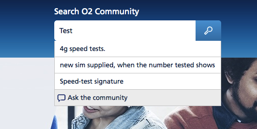
Something that was mentioned in your feedback as a useful example was a suggestions dropdown based on keywords, this has been implemented and it displays topics related to the keyword:
"Sorted by" options now only include best match and by date - other options not used much were removed, such as sort by RSS and Permalink.
On mobile the search box was duplicated so the extra box has been removed. Additionally, some text bits were duplicated, e.g. the "O2 Community" header was displayed more than once, so has been simplified.
"Users" tab was removed as it's not something that is used much. Hopefully the page is now a bit simpler to grasp! We continue looking into relevancy of the content also that is displayed in search results - thank you for your comments on that too.
Please do continue sharing your feedback on these changes, it is much appreciated. 
- 134813 Posts
- 848 Topics
- 7624 Solutions
on 15-03-2018 12:54
- Mark as New
- Bookmark
- Subscribe
- Mute
- Subscribe to RSS Feed
- Permalink
- Report Content
on 15-03-2018 12:54
@MarjoI have just tried it quickly.
I typed in Samsung S8. Which was discussed on numerous threads.
When I clicked on the link in the drop down box I was taken to one specific thread.
I didn't have the option of choosing from ALL relevant posts on the topic of the Samsung S8.
So I don't see an improvement there. In fact the lack of choice makes it less user friendly.
Veritas Numquam Perit


