Upcoming design additions
- Mark as New
- Bookmark
- Subscribe
- Mute
- Subscribe to RSS Feed
- Permalink
- Report Content
on 12-09-2014 17:27
Hi guys, how’s your day going?
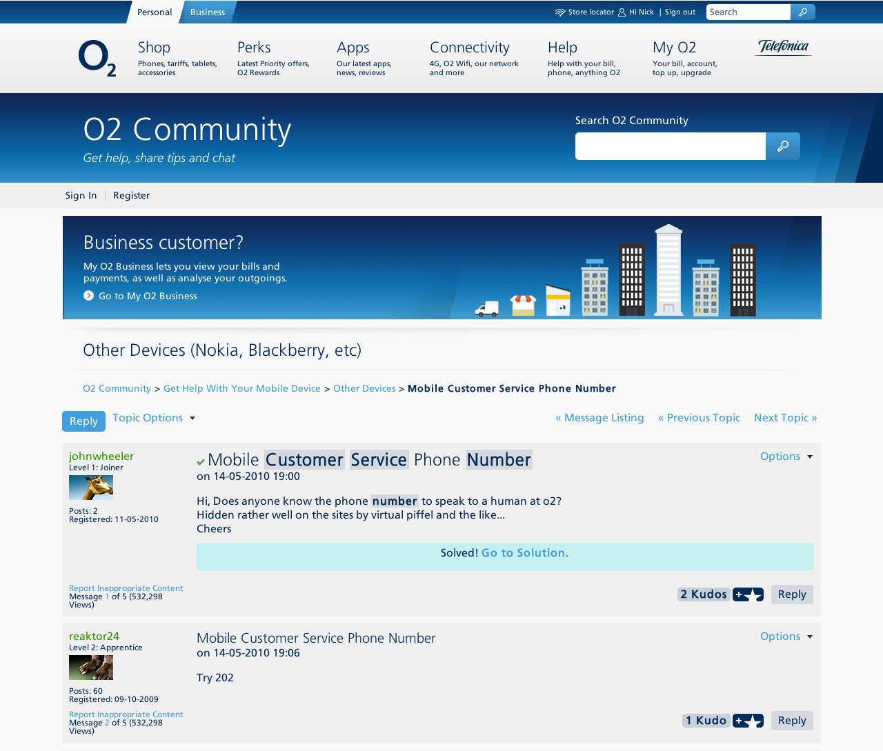
One of the things we have been working on is a promo image slot that is going to be placed at the top of the forum thread pages soon. We have some options to choose from that I’d like to get your input on before we push any of the configurations live. ![]()
You can see illustrative screenshots of the two design options below. We will either have 2 images or just one longer banner displayed. These will be especially for the benefit of new members who are just joining, and to optimise traffic and awareness to different parts of the site. Bear in mind that the images in the screenshots below are just examples and we will be working on the exact content soon.
So I would like to get your views on the following options:
- 2 smaller images or just one elongated image, at the top of the thread pages (see screenshots below)
- Visible for all users on the forum, or if you have objections (please elaborate), then it can be made visible for only non-logged in users.
Looking forward to seeing your input and which option you prefer seeing. 
Cheers all and have a great weekend!
Marjo
Design option 1: 2 image links at the top of the thread page
Design option 2: one elongated image link at the top of the thread page
- 95758 Posts
- 612 Topics
- 7137 Solutions
on 23-09-2014 15:49
- Mark as New
- Bookmark
- Subscribe
- Mute
- Subscribe to RSS Feed
- Permalink
- Report Content
on 23-09-2014 15:49
Have you taken the mobile view into consideration. Whilst it won't be a problem on desktop I'm just wondering on the effect on the phone.
- 7881 Posts
- 468 Topics
- 55 Solutions
on 23-09-2014 16:38
- Mark as New
- Bookmark
- Subscribe
- Mute
- Subscribe to RSS Feed
- Permalink
- Report Content
on 23-09-2014 16:38
- 95758 Posts
- 612 Topics
- 7137 Solutions
on 23-09-2014 16:55
- Mark as New
- Bookmark
- Subscribe
- Mute
- Subscribe to RSS Feed
- Permalink
- Report Content
on 23-09-2014 16:55
- 151862 Posts
- 650 Topics
- 28847 Solutions
on 23-09-2014 19:03
- Mark as New
- Bookmark
- Subscribe
- Mute
- Subscribe to RSS Feed
- Permalink
- Report Content
on 23-09-2014 19:03

Please select the post that helped you best and mark as the solution. This helps other members in resolving their issues faster. Thank you.
- 5063 Posts
- 113 Topics
- 12 Solutions
on 23-09-2014 21:26
- Mark as New
- Bookmark
- Subscribe
- Mute
- Subscribe to RSS Feed
- Permalink
- Report Content
on 23-09-2014 21:26
A question from a new user, why is there a 25mm gap each side of the main body of the forum page...is it for aesthetics or is there a technical reason ?
- Mark as New
- Bookmark
- Subscribe
- Mute
- Subscribe to RSS Feed
- Permalink
- Report Content
24-09-2014 22:16 - edited 24-09-2014 23:06
Beenherebefore wrote:
A question from a new user, why is there a 25mm gap each side of the main body of the forum page...is it for aesthetics or is there a technical reason ?
Well that seems to have stopped them in their tracks, @Beenherebefore . I would hazard a guess the margins are the inches they give us so we can take a mile.
More seriously there can be few things more unsightly than a web page that stretches the full width of the screen.
Gerry
- 5063 Posts
- 113 Topics
- 12 Solutions
on 24-09-2014 22:23
- Mark as New
- Bookmark
- Subscribe
- Mute
- Subscribe to RSS Feed
- Permalink
- Report Content
on 24-09-2014 22:23
But the headers and footers do !
- 11577 Posts
- 520 Topics
- 213 Solutions
on 25-09-2014 09:29
- Mark as New
- Bookmark
- Subscribe
- Mute
- Subscribe to RSS Feed
- Permalink
- Report Content
on 25-09-2014 09:29
The gap is there as to help the forum adapt to a range of device's sizes. I'll take the observation back to the team though. Sorry for the delay in replying, we had a training day yesterday

Get involved:
• New to the community? This is how you get help.
• Want to know who we are? Come and say hi to us.
• Want to have a chat? Drop me a direct message.
- 7881 Posts
- 468 Topics
- 55 Solutions
on 25-09-2014 10:40
- Mark as New
- Bookmark
- Subscribe
- Mute
- Subscribe to RSS Feed
- Permalink
- Report Content
on 25-09-2014 10:40
Also to add, if it was very wide, the text paragraphs in posts would be stretching from side to side. Might not be too bad with smaller screens but I was looking at this just now on my home PC which has a very big screen compared to my laptop for example, and it would be very uncomfortable to read the posts if it stretched very wide.  My head would be moving side to side while I read...
 ![]()
- 95758 Posts
- 612 Topics
- 7137 Solutions
on 25-09-2014 11:06
- Mark as New
- Bookmark
- Subscribe
- Mute
- Subscribe to RSS Feed
- Permalink
- Report Content
on 25-09-2014 11:06
I don't find any problem with the width as it is to be honest.


