- O2 Community
- Discussions, Feedback & off-topic
- Discussions & Feedback
- Re: Community Redesign
- Subscribe to RSS Feed
- Mark Topic as New
- Mark Topic as Read
- Float this Topic for Current User
- Bookmark
- Subscribe
- Mute
- Printer Friendly Page
Community Redesign
on 16-01-2014 09:45
- Mark as New
- Bookmark
- Subscribe
- Mute
- Subscribe to RSS Feed
- Permalink
- Report Content
on 16-01-2014 09:45


on 16-01-2014 09:46
- Mark as New
- Bookmark
- Subscribe
- Mute
- Subscribe to RSS Feed
- Permalink
- Report Content
on 16-01-2014 09:46
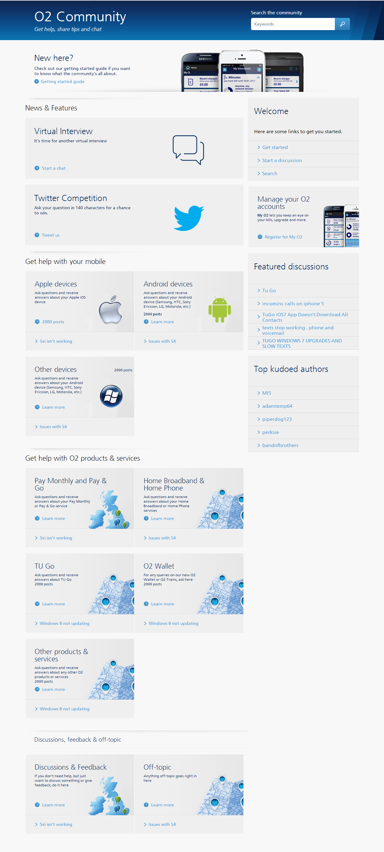
Design #2
- Mark as New
- Bookmark
- Subscribe
- Mute
- Subscribe to RSS Feed
- Permalink
- Report Content
on 16-01-2014 09:47
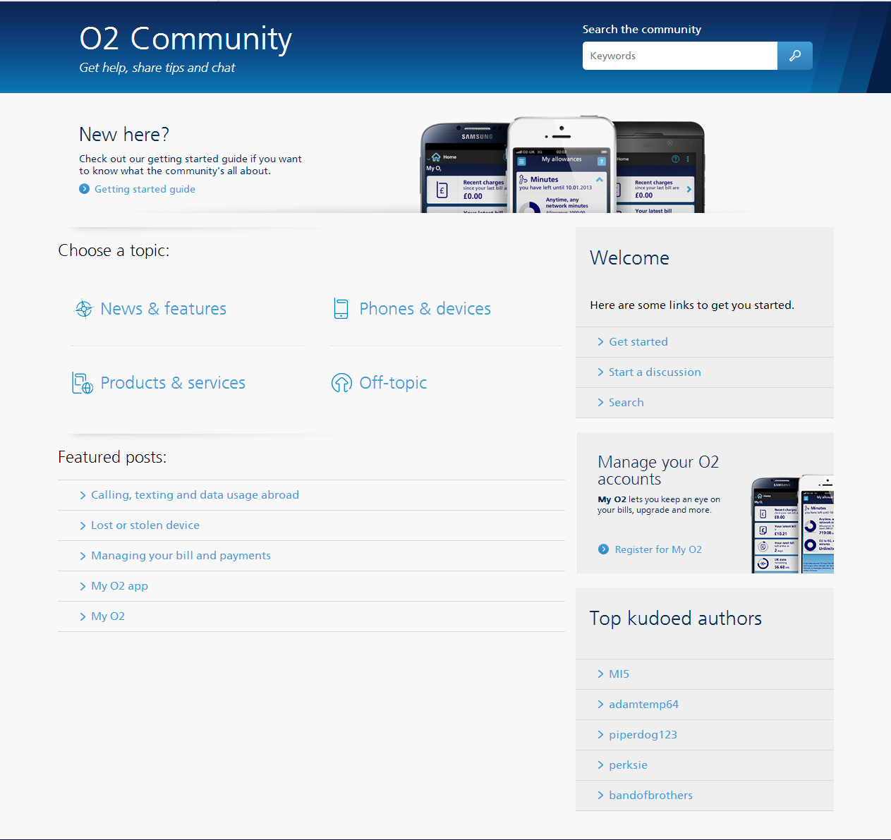
Design #3
- Mark as New
- Bookmark
- Subscribe
- Mute
- Subscribe to RSS Feed
- Permalink
- Report Content
16-01-2014 09:50 - edited 16-01-2014 09:51
Hi Chiara,
I like the 2nd option.
- Mark as New
- Bookmark
- Subscribe
- Mute
- Subscribe to RSS Feed
- Permalink
- Report Content
on 16-01-2014 09:53
I agree with BoB, I like the second option.
- Mark as New
- Bookmark
- Subscribe
- Mute
- Subscribe to RSS Feed
- Permalink
- Report Content
on 16-01-2014 09:56
Thank you for the feedback  Could you please elaborate and tell us what you particularly like of the chosen design?
- Mark as New
- Bookmark
- Subscribe
- Mute
- Subscribe to RSS Feed
- Permalink
- Report Content
on 16-01-2014 10:03
No 2 looks more 'compact' than 1, but less basic than 3.
- 154750 Posts
- 658 Topics
- 29443 Solutions
on 16-01-2014 10:07
- Mark as New
- Bookmark
- Subscribe
- Mute
- Subscribe to RSS Feed
- Permalink
- Report Content
on 16-01-2014 10:07
Cleaner layout.
Hopefully there will be room for our "Guides" that we have been writing for Toby too ?
Please select the post that helped you best and mark as the solution. This helps other members in resolving their issues faster. Thank you.
- Mark as New
- Bookmark
- Subscribe
- Mute
- Subscribe to RSS Feed
- Permalink
- Report Content
on 16-01-2014 10:10
Cleaner, that's the word I was looking for!
- 11577 Posts
- 520 Topics
- 213 Solutions
on 16-01-2014 10:11
- Mark as New
- Bookmark
- Subscribe
- Mute
- Subscribe to RSS Feed
- Permalink
- Report Content
on 16-01-2014 10:11
@MI5 wrote:
No 2 for me too.
Cleaner layout.
Hopefully there will be room for our "Guides" that we have been writing for Toby too ?
Thats the plan MI5.
Keep the thoughts and opinions coming guys!
Get involved:
• New to the community? This is how you get help.
• Want to know who we are? Come and say hi to us.
• Want to have a chat? Drop me a direct message.
![community-v2-desktop-feedback[1].jpg community-v2-desktop-feedback[1].jpg](https://community.o2.co.uk/t5/image/serverpage/image-id/6252iD7695B145B662E5E/image-size/original?v=mpbl-1&px=-1)


